
I've been really busy these past few months and thus I haven't really the time I'd like to have to update this blog, haha. For now I'll just post about how I made the official poster for NOTCOPS. One of the key inspirations for it, as it is a film poster, was how hollywood movie posters would advertise their products and attract attention. It was the works of Drew Struzan that appealed to me in how they framed their main characters and plot devices in the image.


So with that in mind I attempted my first experiments in the poster last March. They all lacked a sort of impact that really made the viewer explore the image or get excited over. More over it was flat.
 With the help of some colleagues and friends I had identified several things I must do to create a visually arresting poster including using the colour pallete to establish depth and bring focus to the characters and to avoid making things too "centred" because it creates a static image and takes away from the dynamism that my film embodies. Things that I had realized in the process of making the posters was that I needed to communicate the relationships between the characters in the film. One thing Chris Williams (Glago's Guest, Bolt) once told me was that it was to crucial to establish the conflicts and relationships between the characters in the film.
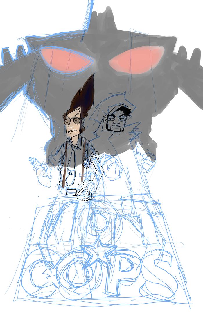
 Even though Officer Lee is a critical "Zenigata" styled character in the grander story, He doesn't fill an large enough role in the debut NOT★COPS film to feature in the poster as he departs early in the film without having his character as fleshed out as the others are. As both Inspector Prat and Officer Goodson are as obsessed with their image and more intent on making their "real" cop personas into reality, they don't acknowledge the robot's existence until it gets the way of their hotdog snack-a-thon. To make a point in the fact they are actually not cops, Prat is shown without his revolver, instead fashioning his hand as a pistol much like a kid playing cops and robbers would do. Because of this, in the poster, they are intentionally shown in centre stage posing in a manner that would indicate their inflated egos with their backs to the robot, which is shown in the far background in the upper left corner (its back turned too as it's more intent on destroying the city until it identifies the NOT COPS as a viable threat later in the short) bleeding over the edges of the poster creating a visual tension while blending into the scenery of a near-future Yaletown. The creation of the city of Vanhattan, as it's a future vision of Vancouver crossed with the density and size of New York, involved much research into the future developments in the city of Vancouver. Not only are there buildings to have yet be built in the film, but also historic ones that were demolished or proposals that never were approved. Featured in this poster in particular are two buildings that have yet to be built in Vancouver: The Mark and The Rolston

Shown below is a visual guide to the character relationships (in green).
 Also, in this image I've highlighted the NOTCOPS, logo in red and everything else in blue. Following on prior advice, I had first started painting the image by doing a red wash on the characters and a blue wash on the robot and background to establish the depth before going on to finish the painting. I was careful to make sure the characters stay relatively warm to bring them to the forefront and thus be the first thing the viewer focuses on and leave the background relatively cool so that the detail in the city does not make the image confusing. Eventually I landed with the image as you see at the top of this blog entry (also note the intended blue space around the logo to accommodate additional text and logos). Either way, that's that and to cap it all off, i'll finish with the inking, inking being my favourite and more time consuming part of the process.
