Just as an introductory note, I got my Deviantart back up and running at PRASTSHACKER.
Also, Tourism Vancouver or uh, Inside Vancouver did an interview of me and that's up right now.
Over the summer I went to work on producing some stickers to give away at Vancouver's Anime Evolution. The ones I produced were from Valve Software's popular videogame, Team Fortress 2. The whole set was completed as of last August on the eve of the convention. The series of images were a style I discovered when I started producing them in my spare time from mid 2008, the first of which after socializing with a friend over a videogame imageboard.
The style I originally had in mind with was similar to the sort of MSPaint comics that imageboard is known for. I made the first image in 2008 with MSPaint based on the Scout. I felt like making it deliberately messy and with a very rigid and blocky shape to reference the swift and sharp wit of the character with the dynamic perspective of the image to showcase his agility. However I found the outcome in colouring awfully time consuming so instead I decided to finish it in photoshop.
 Which was pretty cool and alot of people really liked it. Originally it was just the Scout but people wanted to see more and so, a few months later i produced the spy, with his pose similar to a photo of that of W.T. Snacks as an in joke. This time going for a more darker image in contrast to the scout because the spy IS MYSTERY.
 While this was really good in its own right, I later on felt the relative realism in the face didnt really fit the context of the characters. Yet in May 2009, I completed the Pyro. This time, opting to leave much of the preliminary sketches on the image to replicate the chaotic nature of the character themself.
 Another big change was the colouring, which was full on produced in photoshop CS4 with Gradients and some liberal application of brushwork.
After that, it wasn't really until this past June did begin work on producing the next ones, actually starting with the Demoman in July.
 Which I decided to impliment a cleaner lineart form in Sai instead of MSPaint, ofcourse losing the aesthetic appeal of being made in the program, but really who cares lol. On top of that, I expanded on the precedent of the pyro and made the colouring more painterly to complement the gradients. This was also the first to use a dramatic background which I felt needed the flair as the character had no "words" in the background, only the smug expression of drunken godliness. Then in July I produced the Heavy
 Keeping it largely gradient-work to stay in line with the older works. Several revisions were made to create a believable stance from this perspective and even now I feel I could've done better. Live and learn, I suppose. I placed him on a capture point eating a sandvich, really to play up some of the cartoony aspects of the game.
One of the most recent and favoured of the classes that I've produced is the Sniper. At Anime Evolution, it was the only sticker that sold out. That says alot to aspects in the image which I need to replicate in the future for aesthetic and business reasons.
 The image combined many of the characteristics of prior images in the series. I gave it a slight background to tone down the whiteness of it (drowning out the image) and produced props for the image as well, borrowing from the heavy as setting produces a narrative that can evoke humour or in this image, tension. I feel it was the addition of narrative that made it so desirable and eyecatching, it seemed like something greater outside of the sticker was going on.
In my opinion, the process in creating the stickers shows a pretty distinct growth in my technical abilities between 2008 and this summer. Given the success my friends had selling fanart material based off of various game franchises, I decided to continue producing stickers for various franchises for art events and conventions to come.
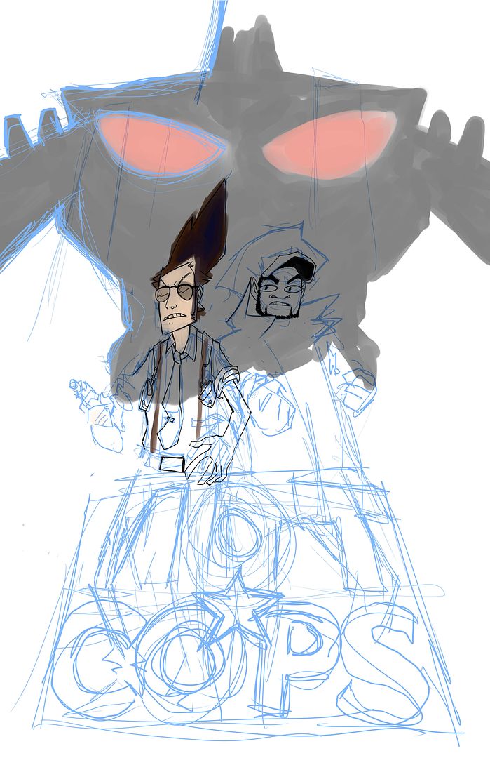
In that, seeing how a bright and cartoony palatte was used for the Team Fortress 2 series, I figured that perhaps I'd produce the stickers with colouring schemes that fit the aethestic of the source material best. The first work I've produced since Anime Evolution in light of that is for the Ukrainian Survival Action title, S.T.A.L.K.E.R: Shadow of Chernobyl.

Featured is a Bloodsucker, an iconic monster from the title. Not only is this relatively more detailed, but i feel it represents the feel of the game I derived it from. Entirely made in Sai.
Other than that, that's been one of the larger projects I've personally undertaken/continued over the summer. At this moment I'm beginning classes again on the path to recieving a 2nd bachelors degree from Emily Carr and should be done with that by mid 2012.


